Colour Trends of 2019
By Nirdesh, Ravi Agarwal on Jul 15th, 2019
2019 is witnessing an imaginative, European revival with bold colors taking center stage in interior design. With more designers and homeowners seeking bold palettes, a culture of newfound color confidence has successfully challenged the status quo this year.
In a fitting tribute to dramatic and daring design, this season’s Colour of the Year is Awakening, a dynamic shade of plum that combines the dignity and power of purple with the humility of brown. The color is an embodiment of strength, confidence and courage, and inspires four compelling color stories, pointed at finding expression across design disciplines in the months to come.
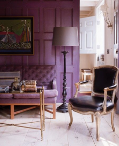
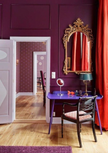
Bright, perky colors punctuate practical greys
The twenty-first century is witnessing a cultural transformation, with millennials favoring fuss-free spaces, multifunctional furniture and fluid designs over conventional fixed layouts.
In a reflection of this sentiment, a new visual paradigm of bright, perky colors, striking typefaces and repurposed materials are slowly eclipsing more muted design schemes. Adulting tells this story of fun, quirk and whimsy; of growing and evolving at one’s own pace, on one’s own terms.
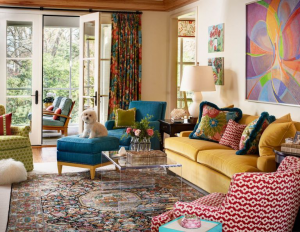
Stylist’s tip: Play up your aesthetic by mixing prints and patterns across rugs, towels, cushions, curtains and other decor pieces. Remember, odd numbers work best, so start with three distinct patterns and work your way up. Make your first piece the shining star of your aesthetic by choosing something bold and large-scale. Choose a second piece in the same colors as your first but in a pattern half the scale, and a third in neutral or complementary tones in a small print.
Living colors – algae dyes and biodynamic tones
With design sensibilities gravitating towards earthy textures, grass-root designs and organic materials, we see a colour harvest seeded in sustainable innovation. Organic palettes, natural elements such as algae, biopolymers and fungi are inspired by the treasures of nature. A radical new natural infused with a raw luminescence in textures that mirror organic matter, it serves as a re-imagination of living, breathing color.
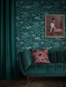
Stylist’s tip: Use living colors to highlight mixed wall art, accessories and statement lighting. Also, consider creating a stylish vignette on a spare console table. Arrange photo art, curios, lamps and plants into a curated display against a fresh colour backdrop.
Dense, deep colours mixed with subtle metallics
There’s something about deep tones and metallic finishes that summons visions of brilliant stardust, soft moonshine and an undeniable spirit of magic. It’s a scene synonymous with fantasy movies, far removed from the trappings of the real world. The aesthetic is an interplay of bold patterns and prints, shadows and light, and metal accents.

The vivid theme weaves fantasy through nature, providing an escape for modern-day digital denizens shackled by technology. It brings alive dense, deep colours, translucent undertones and subtle metallics that render a touch of mystique.
Stylist’s tip: A half-height headboard juxtaposed with a deep-toned wall can serve as a dramatic design statement without appearing overbearing or taking up your entire wall.
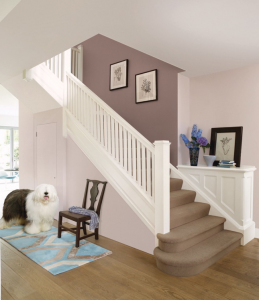
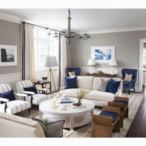
Nudes and mattes are unfussy and sure to stand the test of time. Minimalist shades are gaining recognition by creators for their value in design, and are capable of blending into an array of decor schemes. They spell a new luxury ethos; one that is authentic, personal, minimal and local.
The palette evokes a quiet richness, with colours that are confident, timeless and sophisticated, mirroring an artisanal aesthetic with a bare essence.
Stylist’s tip: Plants can add fresh pops of colour and enliven a dull bathroom. Areca palms, money plants, peace lilies, snake plants and aloe vera are some low-maintenance indoor plants you can consider.

